Beth Harmon, the protagonist of The Queen’s Gambit and chess wunderkind, doesn’t quite find her fashion footing until she gets more opportunity in both the chess arena and in the overall arena of life. At the beginning of the series, her wardrobe was decided for by other people—in fact, the one piece of clothing that truly belonged to her was burned by Headmistress Deardoff literally in the first episode—so it’s understandable that it took her a bit to feel like any look was hers to own. However, fashion eventually becomes an integral part of Beth Harmon’s character, we see this right after she wins her first tournament and uses her prize money to purchase a chess set, chess books, and the plaid pinafore she eyed her first time at the store. As the show progresses, you get to see more of her flair and complexities (and love for shopping) develop——in all their ‘60s glory.
This is part of a series dissecting 4 shows that have been defining the recent interest in “Regency-core”, this particular article will focus on stylistic motifs and concepts found within Netflix’s The Queen’s Gambit. (We’ll try to keep the spoilers to a minimum.)
Check your plaid, mate.
Prints are an integral part of Beth’s costuming—the choice of plaid and checkered prints as a tongue in cheek reference to the checks on a chessboard, we don’t know for sure, but we remain hopeful it was a meta costuming decision. While the ‘60s are known for relatively wild fashion, the context Beth Harmon exists in isn’t really made for the hippie beat. Through her wardrobe, we see a different side of the era—one still teeming with parties and drugs, but seemingly more conservative in style. Plaid and checks have been a part of her life since her arrival at Methuen—where the headmistress assigned her a sad plaid pinafore and short-sleeve shirt—up until her final competition in Russia where she chose to wear a phenomenal grid printed coat to all of her games. Plaids, grids, and checks are considered neutral in the print and pattern world, if you’re looking to mix prints, these offer great balance.

From eyeing her first self-bought dress to
playing the chess elite in Moscow, Beth
Harmon’s proclivity towards chess board
themes is unmissable.

Color me stoked.
Beth Harmon is not by any means a maximalist—if I remember correctly, the brightest color she wore was a pink (checkered, obviously) coat in Paris—but she is, by most definitions, very glamorous. Her minimal use of color, either opting for black and white (a la chessboard) or an assortment of blues that provides a direct and refreshing contrast to her auburn-colored hair, is something that I can see being used more in the upcoming months. She manages to break molds and add a bit of glitz to the world of chess without needing too much fanfare, which I think resonates with a lot of us today who are trying to construct elevated looks without all the pre-pandemic effort. It’s no secret that earthy tones (browns and khakis) are in lately, perhaps The Queen’s Gambit will ensure this affinity for sensible colors lasts a little bit longer?


Left: Beth Harmon in her checkered pink coat, spending her last dollars in Paris on designer
clothes.
Right: a more understated, but incredibly elegant drop waist dress that also references the
colors of the game.
Leather is the new denim.
Leather is always in style. Beth Harmon and Benny Watts, however, make this classic material feel new to me in all the best ways. Benny Watts’ style is one that is not as heavily praised as Beth’s, but I’m personally a big fan of his brooding leather trench coat, cowboy hat, knife-in-pocket chess prodigy look. The ruggedness of leather contradicts the perceived preciousness of the chess world and Benny intentionally uses this friction as a means to democratize the game and expectations of players. Beth Harmon, through the use of oxford loafers and satchels, wears leather in a more traditional way, which I think will make a big comeback. Oxford loafers are perpetually in and out of the zeitgeist—at times the general mood of the fashion public is that it’s a classic footwear option, at other times it might be considered a bit too retro and hipster. In any case, I stand by the former opinion: oxford loafers are a classic. Frank Sinatra wore them and Beth Harmon did too (anyone else notice the continuing of a black and white theme in these shoes?).

Right: Benny Watts in his bad boy of chess
uniform.

Left: Beth Harmon finally gets some oxford
loafers!

Let’s talk silhouettes.
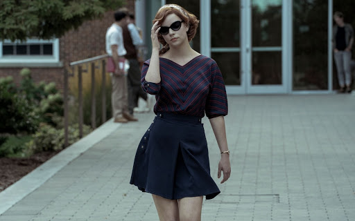
Beth’s choice to wear pinafores and jumpers even after she’s adopted is complex. As we all know, self-expression is convoluted and sometimes we don’t understand why we like what we like, but I’d say this silhouette is one that feels safe for Beth. (No shame at all because I love a plaid pinafore, so classic and schoolgirl-adjacent.) As she grows older and the jumpers start to accentuate her figure, she develops a proclivity towards high-waisted looks and I think this is my favorite development in her style. Whether it’s in her iconic “Fever” ensemble where she’s wearing high waisted slacks and a short-sleeve collared shirt, or when she’s taking a stroll with Benny Watts dressed in a wide V-neck chevron print blouse tucked into a high-waisted navy skirt and a floral scarf around her head (and dark sunnies)—she manages to look powerful and feminine. If these shapes resonate with you, we have a free pinafore pattern here and one for high-waisted trousers here.

Left: Personally, my favorite outfit worn by Beth Harmon. She looks sexy, stylish, and like
someone who is not to be messed with.

Right: Beth at her first tournament where she meets and subsequently beats Townes—in her iconic
pinafore, of course.
If you liked Beth Harmon’s style, another fictional character to draw ‘60s inspo from is Joan Holloway from Mad Men (she wears a lot of incredible looks similar to those worn by our beloved chess queen).
This is the last post in our exploration of current Regency-core and vintage trends! Catch you on the next period drama.
