![]()
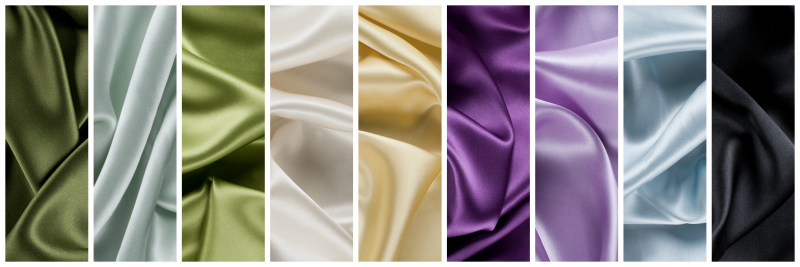
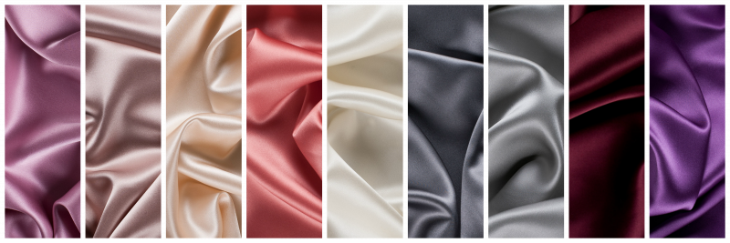
Pantone has released their color forecast for 2018, and it’s filled with vibrant colors and metallic neutrals. Whether you’re in need of natural palettes or taking on tech, there’s a collection for every style and event. Let’s take a look at what designers have already started to do with Pantone’s 2018 color palettes.
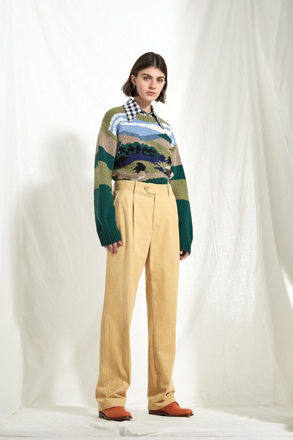
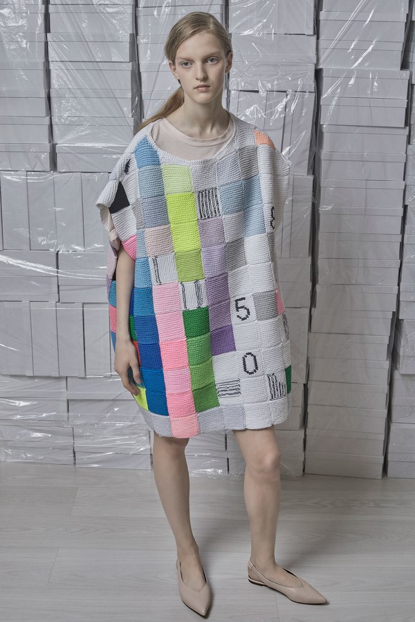
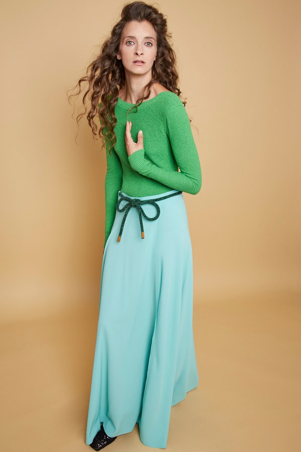
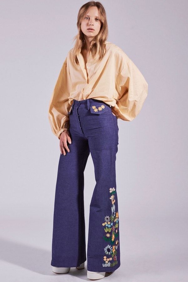
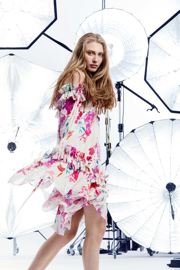
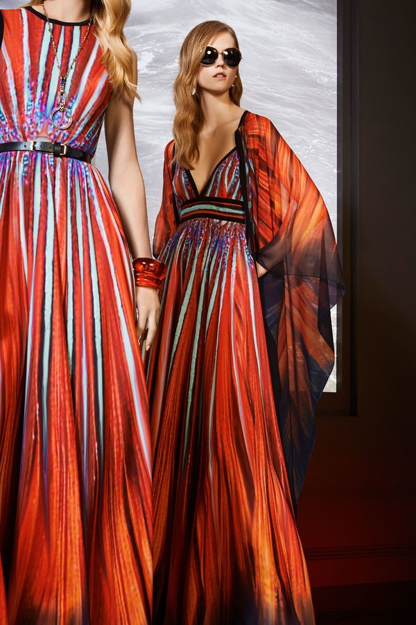
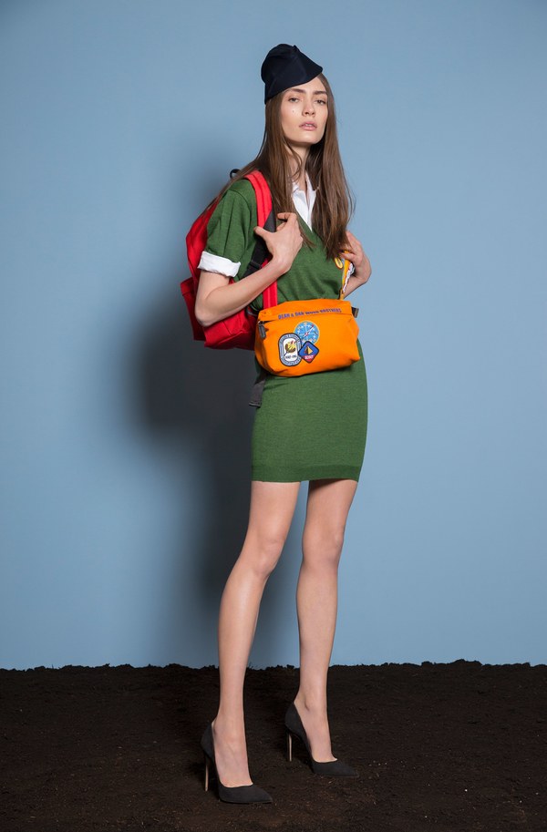
Verdure
Verdure is a colorful garden behind a cozy cottage, nuzzled up deep in a redwood forest. It’s filled with luscious eggplant, carrots with bushy green tops, and succulent squash. Their roots embrace the Earthy soil, as their flowering tops reach for the expansive sky above, a brilliant pale blue in the morning, a rich navy as the evening overtakes this serene oasis.
Shop the Mood interpretations of Verdure: Pesto, Dewkist, Perido
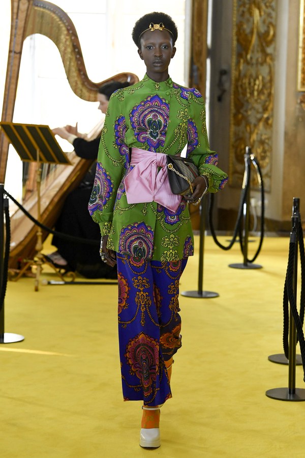
Gucci | Resort 2018
Joseph | Resort 2018
Vika Gazinskaya | Spring 2018 Ready-to-Wear
Veronique Leroy | Resort 2018
Oscar de la Renta | Resort 2018
Verdure is perfect for intricate patterns, like Gucci’s paisley pants and tunic. Veronique Leroy uses separates to show of this collection of colors, using the background as part of the color collection. Joseph’s mountain scene sweater plays to verdure’s natural strengths, while Vika Gazinskaya uses patchwork to play with this pallet. Wear Verdure to the local botanical garden, or have land meet sea at the closest aquarium.
Playful
Playful is a room filled with fabrics waiting to be fashioned into whimsical wear. Vibrant velvet, fluffy fur, and simpering silk await their destiny in vivacious shades, rich pinks and bright yellows woven next to dulcet blues, hues of green filling the room with fresh feelings.
Shop the Mood interpretations of Playful: French Vanilla, Sunny Lime, Peridot, Veiled Rose, Angel Blue, Tango Red, Buttercup, Pesto, and Directiore, or shop the entire Pantone Collection!
Cynthia Rowley | Resort 2018
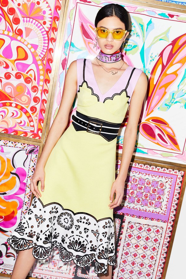
Emilio Pucci | Resort 2018
House of Holland | Resort 2018
MSGM | Resort 2018
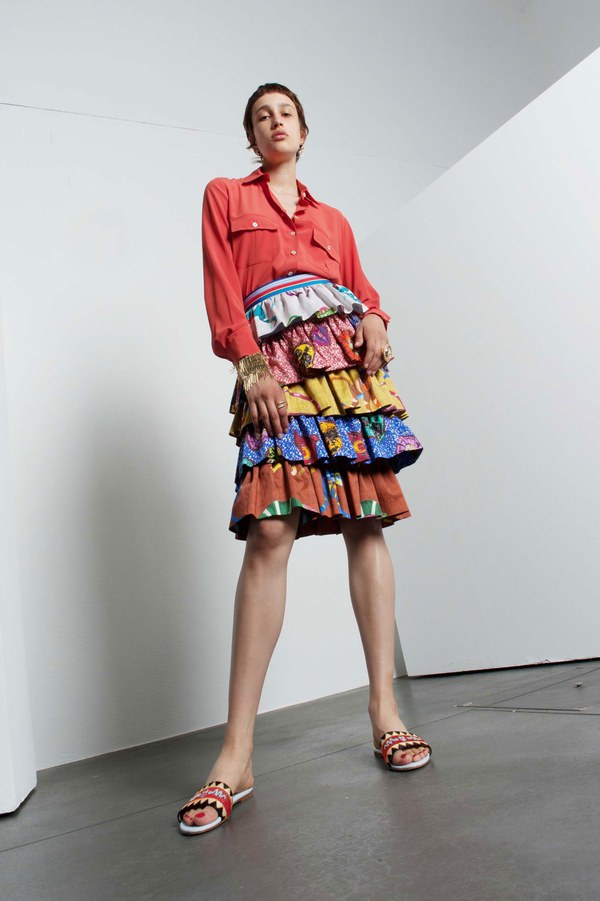
Stella Jean | Resort 2018
Playful was made for exploring, whether that’s hiking a new mountain or finding an underground music shop in Brooklyn. Stella Jean’s tiered skirt shows off playful with a variety of patterns, while Emilio Pucci places playful patterned backdrop, subtly incorporating this collection of colors into this simple yellow dress. Cynthia Rowley pits playful pattern against playful patterns, and House of Holland’s abstract beach scene is reminiscent of playful days by the seaside as a child. MSGM’s blazer makes business more boisterous with the playful palette. Wear Playful colors to a theme park for an exciting day of rides and laughs, or stretch out in the sun on a playful blanket.
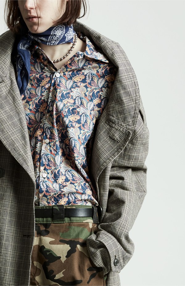
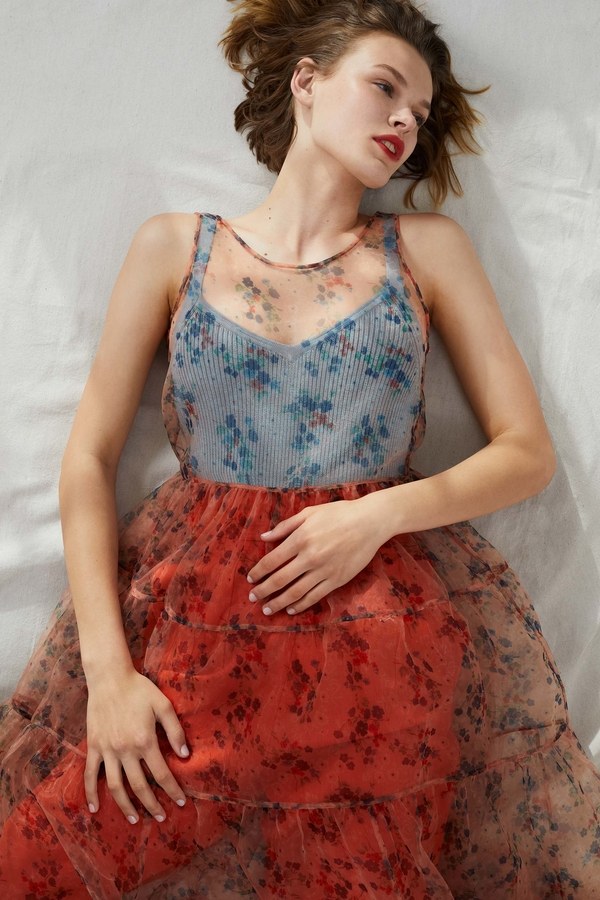
Discretion
Discretion is a sun room on a nippy November evening, the dim autumn sunset filling the room with delicate tones. Gardenia and holly soak in the last of the day’s sun in terracotta pots, sitting on stony granite counters next to a mug of steaming chai and a plate of warmed brie.
Shop the Mood interpretations of Discretion: Polignac, Blush, Cream Pink, Coral, Pale Yellow, Dark Silver, Moonstruck, Maroon, and Bright Purple, or shop the entire Pantone Collection!
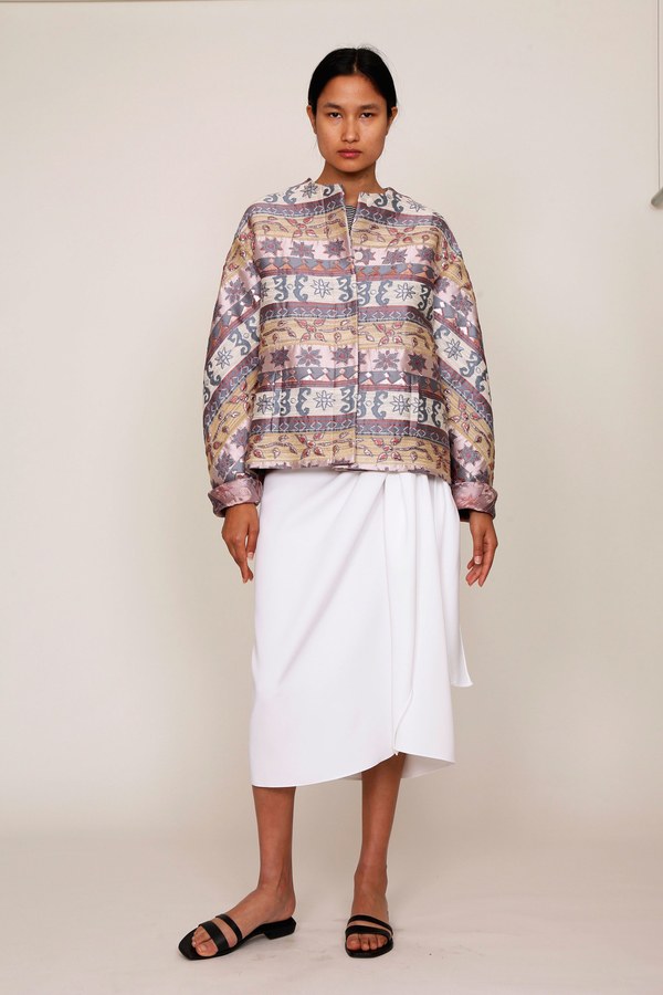
Marchesa Notte | Resort 2018
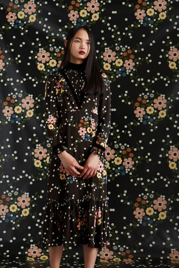
Orla Kiely | Resort 2018
Pamella Roland | Resort 2018
Paul & Joe | Resort 2018
r13 | Resort 2018
Discretion is displayed demurely in Orla Kiely’s dark floral dress, while r13 embeds discretion with whimsy in a paisley button up. Marchesa Notte’s cocktail dress in Discretion is perfect for any classy occasion, while Pamella Roland’s ball gown is soaked in sophistication. Discretion florals crawl up Paul & Joe’s bell bottom pants, proving that discretion can be worn with anything. Wear Discretion at the mom and pop coffee shop, or to poetry readings in the early evening.
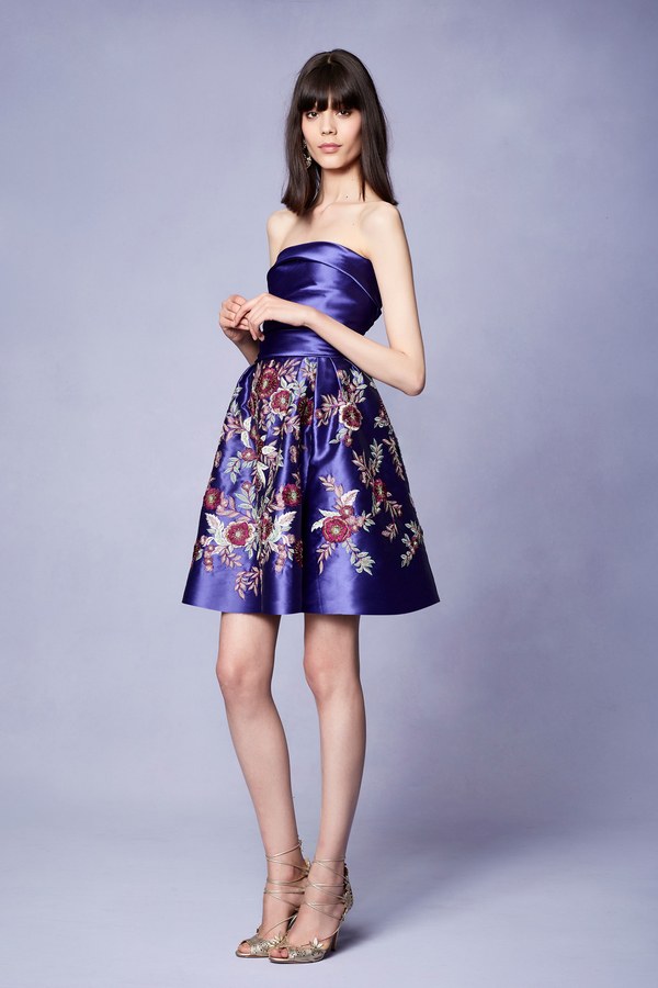
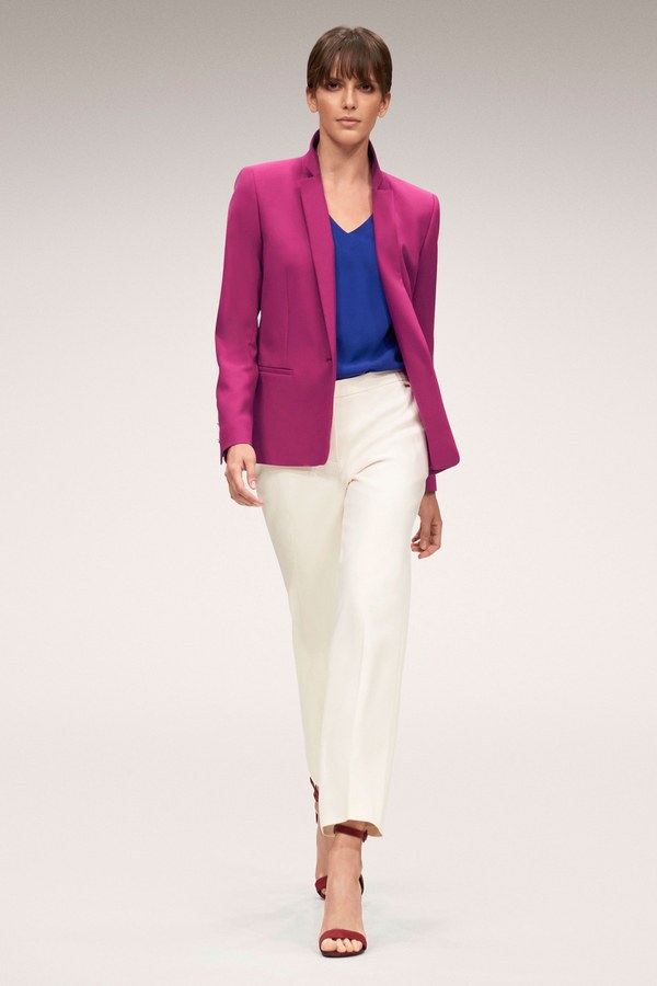
TECH-nique
TECH-nique is a millennial recording studio for upcoming musicians, allowing starving artists to record after hours. A place where creative types come to discuss their art and engage in activism, the advanced recording equipment awash in shades of blue as they create bouncing beats and melodic rhythm. The walls are sound proofed with hues of magenta and purple, the tan carpet bristling in the air, filled with excitement and inspiration.
Shop the Mood interpretations of TECH-nique: Directoire, Gray Dawn, Angel Blue, Bright White, Rapture Rose, Beetroot, Majesty Purple, and Tapioca, or shop the entire Pantone Collection!
Casely Hayford | Spring 2018 Ready-to-Wear
Emanuel Ungaro | Resort 2018
Escada | Spring 2018 Ready-to-Wear
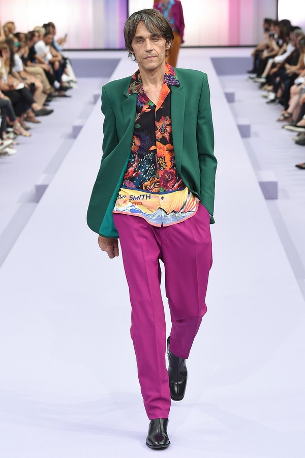
Paul Smith | Spring 2018 Ready-to-Wear
Versace | Resort 2018
TECH-nique’s vibrant colors make it perfect for hanging out at the roller rink or trampoline park. Versace’s TECH-nique skirt and jacket juxtapose patterns against solids, while Paul Smith’s relaxed trousers and tropical top emphasize the casual in business casual. Casely Hayford’s TECH-nique themed pants and seersucker shirt and Escada’s siumilar ensemble are a subtle way to use these palettes, while Emanuel Ungaro’s flowing dress tangles TECH-nique with florals.
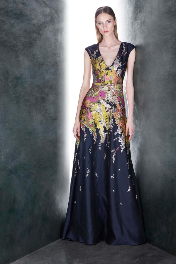
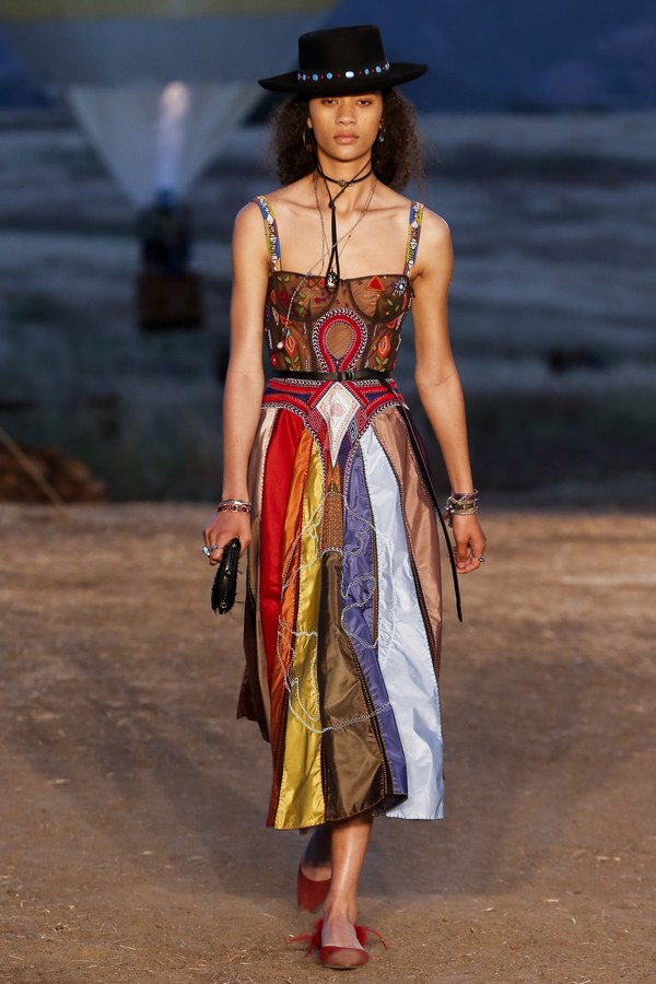
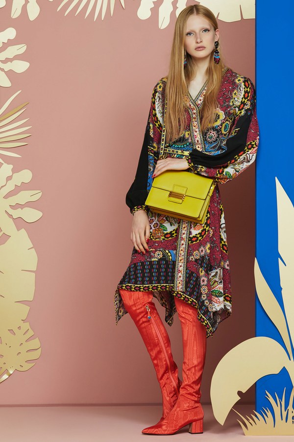
Far-Fetched
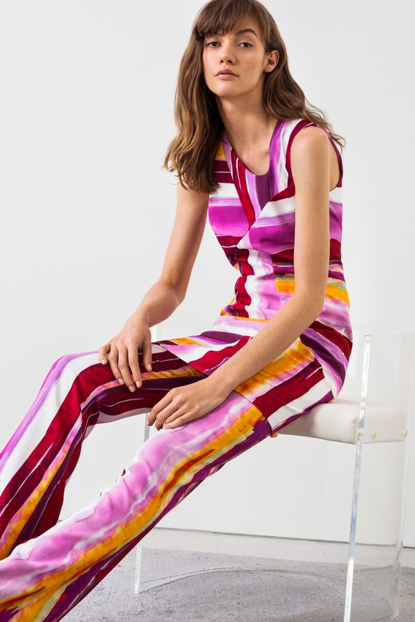
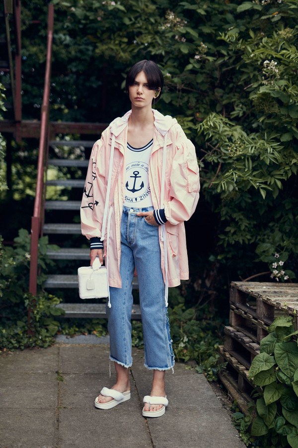
Far-fetched is a youth hostel in Amsterdam, Panama, or Hong-Kong. Its red and orange hues are reminiscent of foreign delicacies, enjoyed with robust wine and new friends. Shades of pink mingle with earthy yellows, evocative of exotic horizons and adventurous travels.
Shop the Mood interpretations of Far-Fetched: Rust, Mandarin, Wine, Toasted, Beetroot, Candy Pink, Tango Red, Pale Yellow, and Gray Dawn, or shop the entire Pantone Collection!
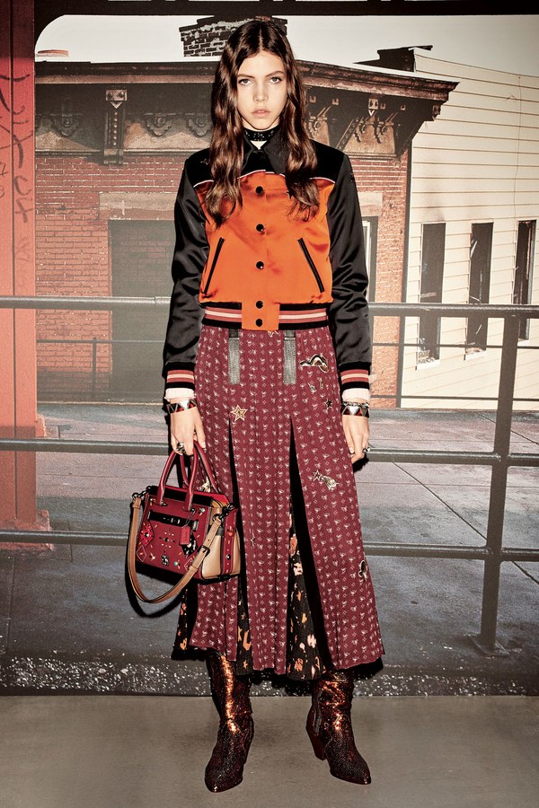
Coach 1941 | Resort 2018
Jeffrey Dodd | Resort 2018
Piazza Sempione | Resort 2018
Natasha Zinko | Resort 2018
Jill Stuart | Resort 2018
Far-Fetched looks fetching displayed in Jill Stuart’s sheer dress over a tank top and pants, while Natasha Zinko uses the more subtle colors of Far-Fetched. Piazza Sempione’s simple pantsuit is a subtle use of Far-Fetched’s coloring, while Coach 1941 and Jeffrey Dodd take advantage of the vibrancy in this pallet. This palette is perfect for midnight strolls through the streets of Venice, or tasting the local delicacies at an Indian market. For a more local ensemble, head to a farmers market in this vivacious palette.
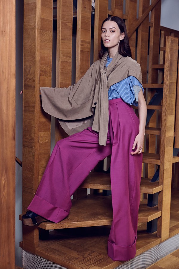
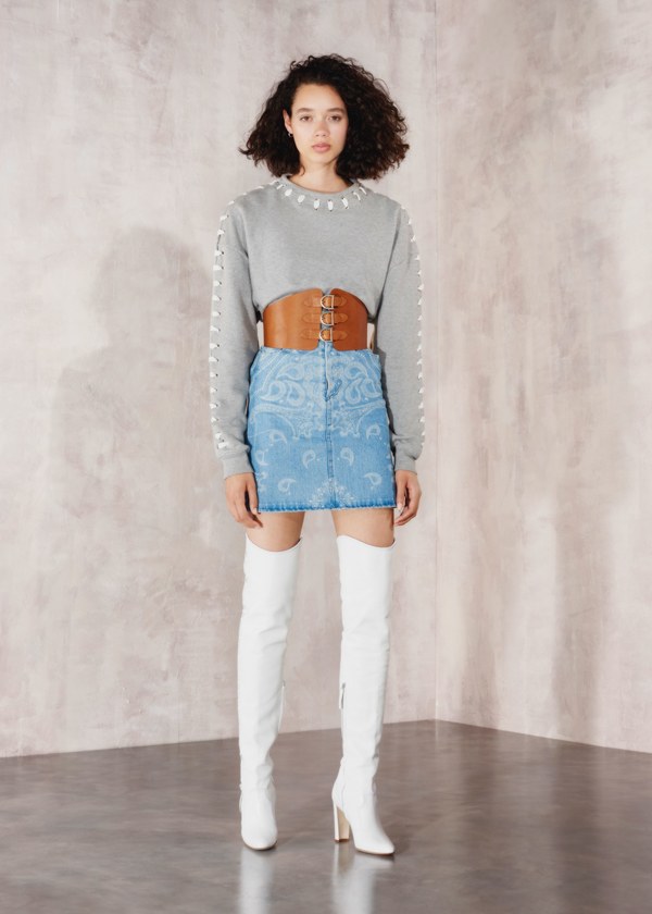
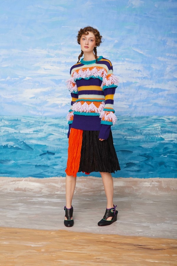
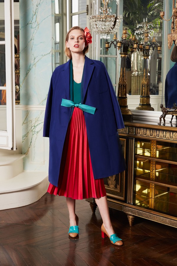
Resourceful
Resourceful is a quiet beach in the summer dawn, shades of orange reflected in the dew that sticks to wispy dune grass. The sun sets the sky ablaze as it rises over early morning joggers. They leave imprints of their bare feet in the tan sand, which sticks to their arches as the water lunges out for them. The light blue of the sprawling sea darkens as the water deepens, hiding small shells and fidgeting fish in waves, folding themselves over in the glistening lights of the rising sun.
Shop the Mood interpretations of Resourceful: Navy, Mazarine Blue, Baby Blue, Deep Teal, Mandarin, Peach Fuzz, Peach, Burnt Orange, and Moonstruck, or shop the entire Pantone Collection!
Christian Dior | Resort 2018
Elie Saab | Resort 2018
Jonathan Simkai | Resort 2018
Nehera | Resort 2018
Tsumori Chisato | Resort 2018
Tsumori Chisato uses Resourceful expertly in a fringe-filled sweater, while Christian Dior and Elie Saab saddle the complementary colors up next to each other. Jonathan Simkai’s jean skirt, paired with the grey sweater and leather belt is a subtle way to incorporate resourceful into casual wear, and Nehera’s Resourceful dress is striped and subtle. Wear Resourceful to a cooking class at the local community collage, or sign up to write for a zine in a Resourceful ensemble.
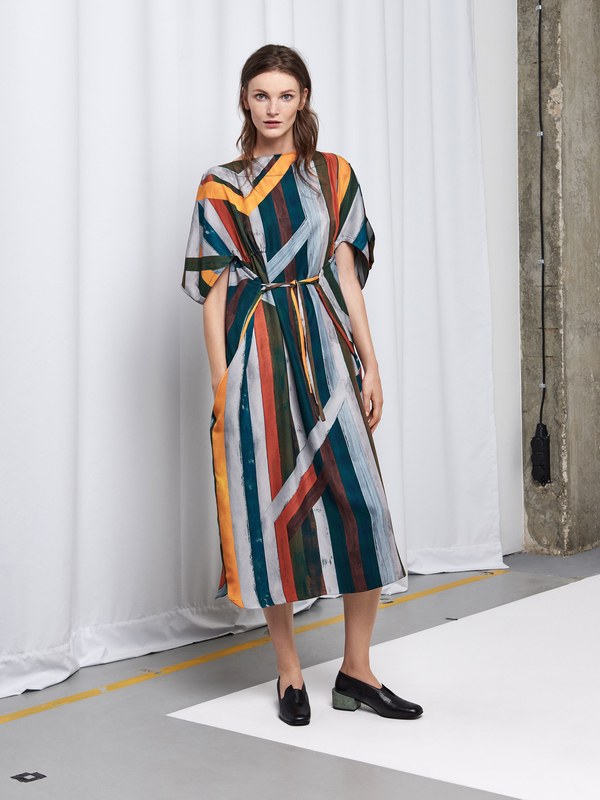
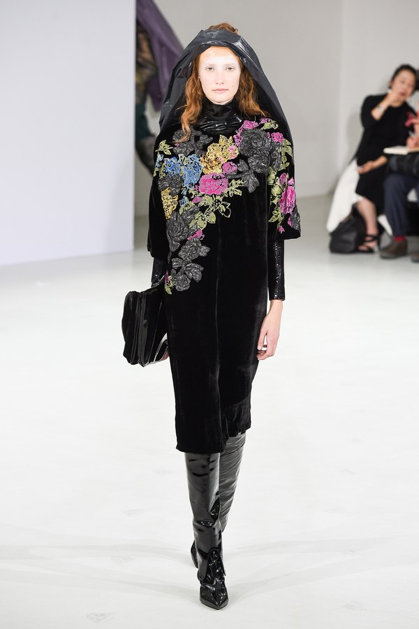
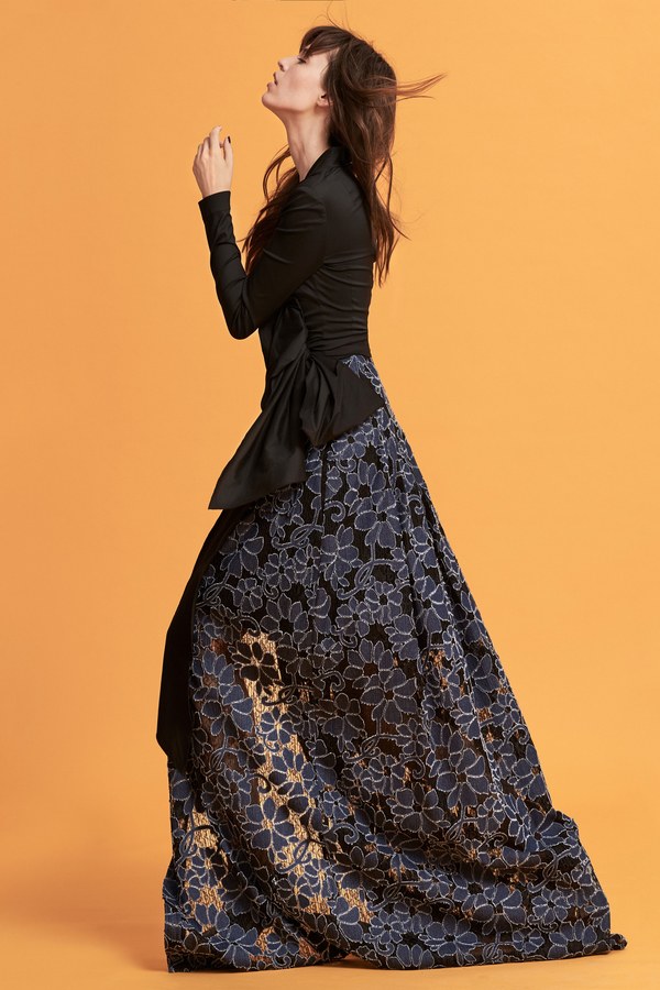
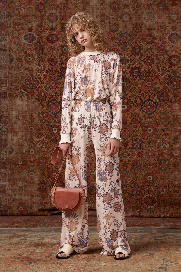
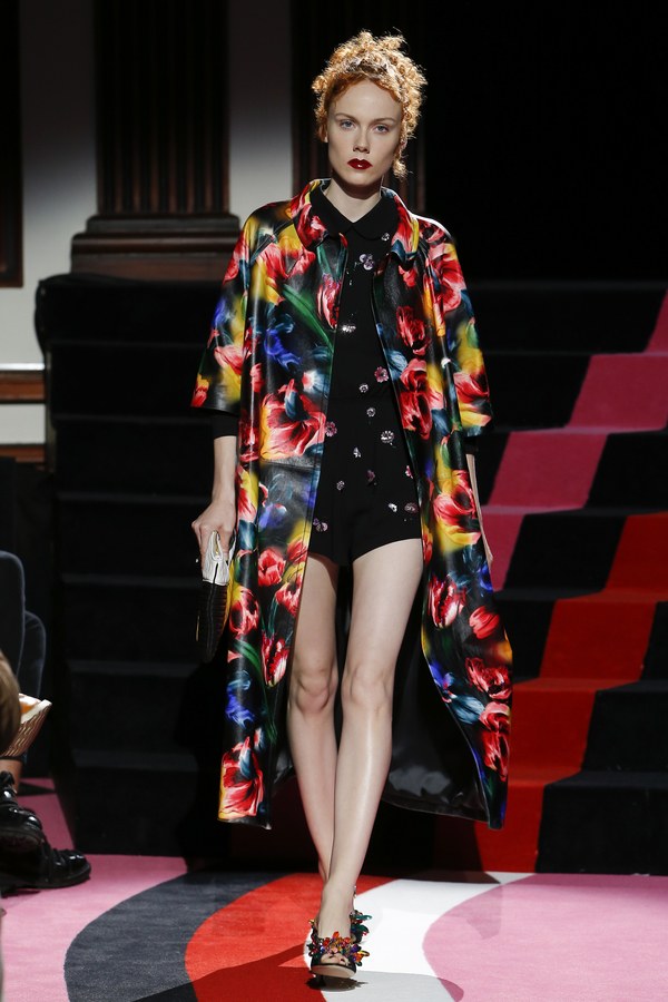
Intricacy
Intricacy is a bookstore in a quaint Vermont town, metallic neutrals seen in the stoic stone building engulfed in snow. The sales clerk can be seen through the window, sitting silently at their desk as they flip through the tattered pages of “Jane Eyre,” candlelight illuminating the inked words on worn pages. The moonlight glints off the windowpane, the old store sign swinging in the brisk December wind.
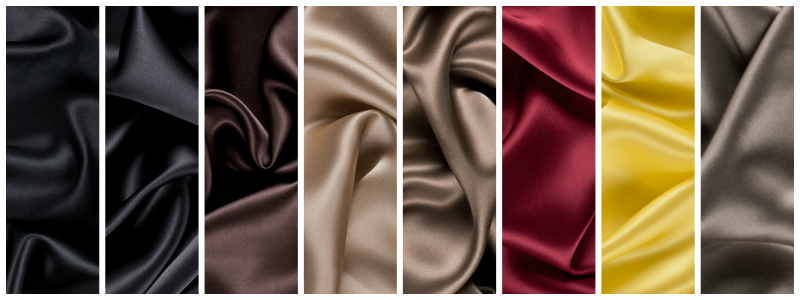
Shop the Mood interpretations of Intricacy: Black, Deep Charcoal, Chocolate, Cornstalk, Ermine, Chili Pepper, Buttercup, and Capers, or shop the entire Pantone Collection!
A.F. Vandevorst | Spring 2018 Ready-to-Wear
Talbot Runhof | Resort 2018
See by Chloe | Resort 2018
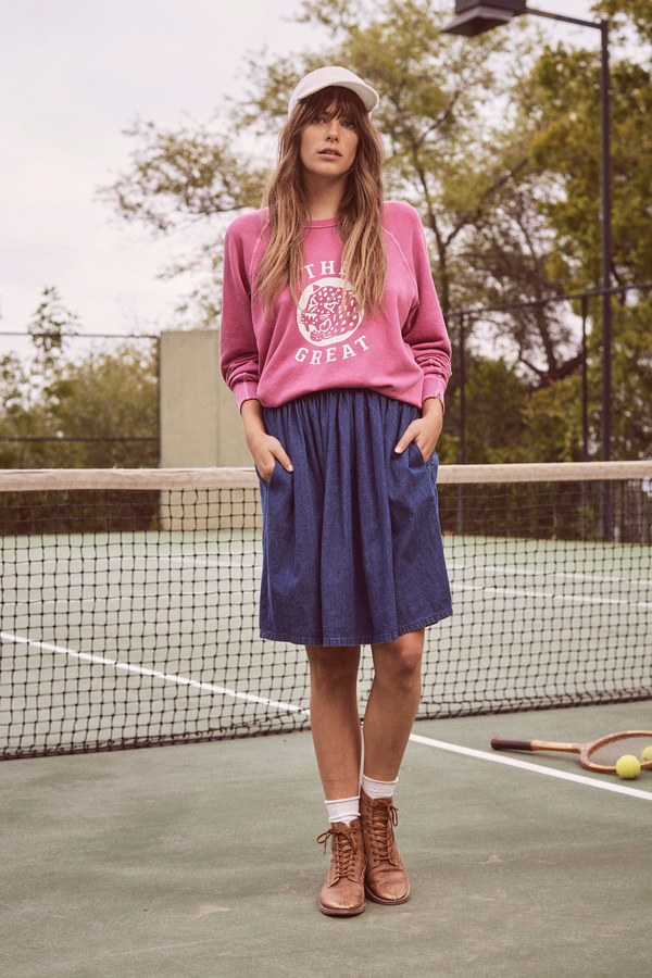
The Great Resort | 2018
Yeohlee | Resort 2018
Intricacy is perfect for a first date, sharing spaghetti and swapping stories over candlelight as you get to know another person. Yeohlee’s Egyption style tunic in Intricacy is similar to other collections hoping on the mythological trend, while The Great Resort goes for a more casual take on this intricate palette. A.F. Vandevorst and Talbot Runhof both use florals to create garments colored with Intricacy, and See by Chloe uses and intricate pattern to display Intricacy.
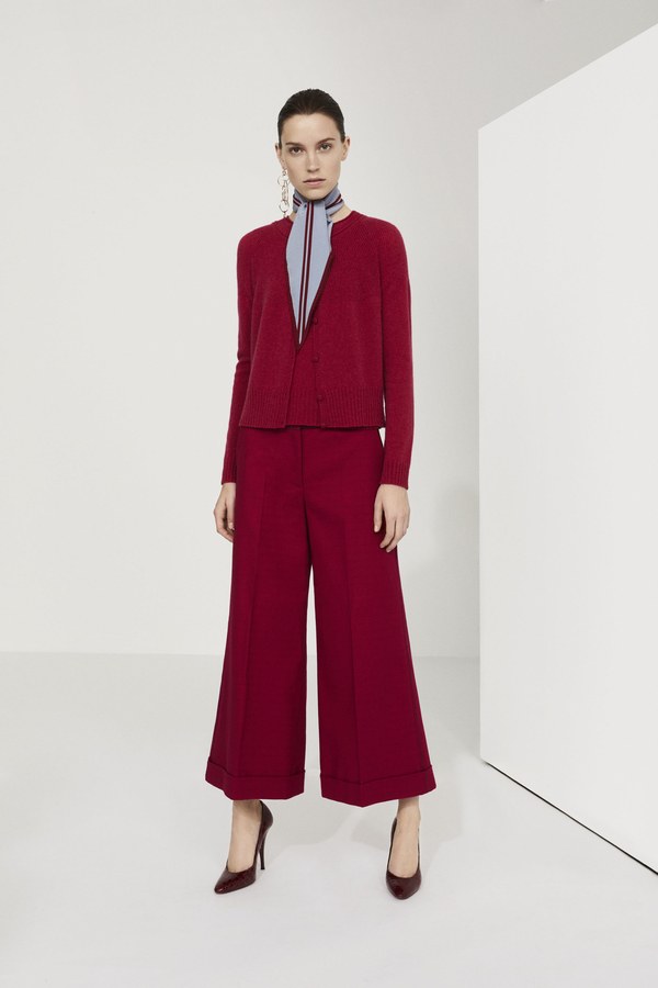
Intensity
Intensity is that first taste of real love, hues of red growing darker and deeper as the partnership swells with dedication and fervor. Black and gold underline the natural balance of power between two lovers, as shades of blue and green display the comfort of having a constant companion.
Shop the Mood interpretations of Intensity: Horizon Blue, Deep Teal, Rust, Salmon, Blackberry, Cornstalk, Red, Black, and Toasted, or shop the entire Pantone Collection!
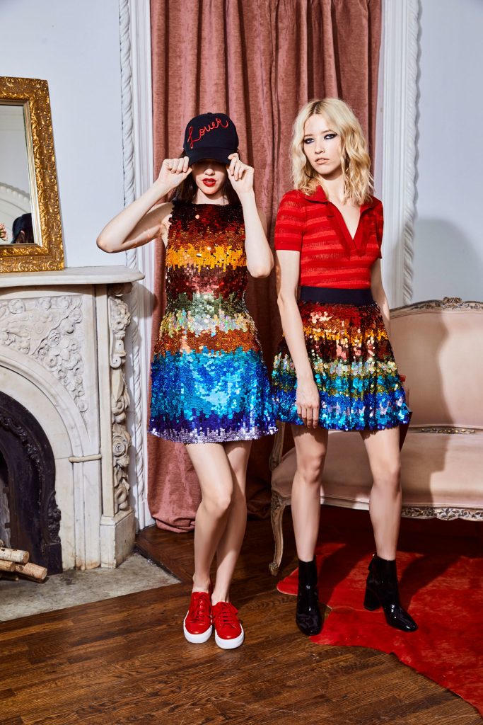
Alice + Olivia | Resort 2018
Dsquared | Resort 2018
Etro | Resort 2018
Miu Miu | Resort 2018
Paule Ka | Resort 2018
Paule Ka’s separates are a wonderful way to display Intensity, while Miu Miu and Etro use some intense patterns to play with this palette. Dsquared2’s Intensity outfit takes this look to the woods with a scout-esque ensemble, while Alice + Olivia use sequins to add sparkle to Intensity. Wear this palette to a fancy Italian restaurant, or reading in the park.
Which is your favorite 2018 color palette? Let us know in the comments!
8 comments
Thank youuu! Valuable information on time for my next collection for girls!
Jocelyn Delgado
Fashion Designer
Good luck on your collection! Don’t forget to tag #madewithmood for any garments made with Mood fabrics!
The most beautifully written colour review I have evrr read! Thank you Molly and Mood 🙂
Thank you! I had a lot of fun writing it, I’m glad you enjoyed it!
Absolutely the best site for fashion news/education, photography and inspiration!
No need to look further . . . it’s all here, supremely edited.
And keeping the sewing flame alive!
We do what we can, glad to see you’re enjoying our site!
Delightful descriptions, gorgeous fashion statement photos! Were you given to writing a follow up piece, I would love to see photos of fashions in these colors that people with real lives and real bodies would wear that were priced to fit in a real budget. Angel blessings!
Thank you! That’s a great idea, I’m sure these colors will be really interesting to see off the runway, I would love to be able to look into that.